iMusician / Musician Digital AG
Design system, UI Design
2020
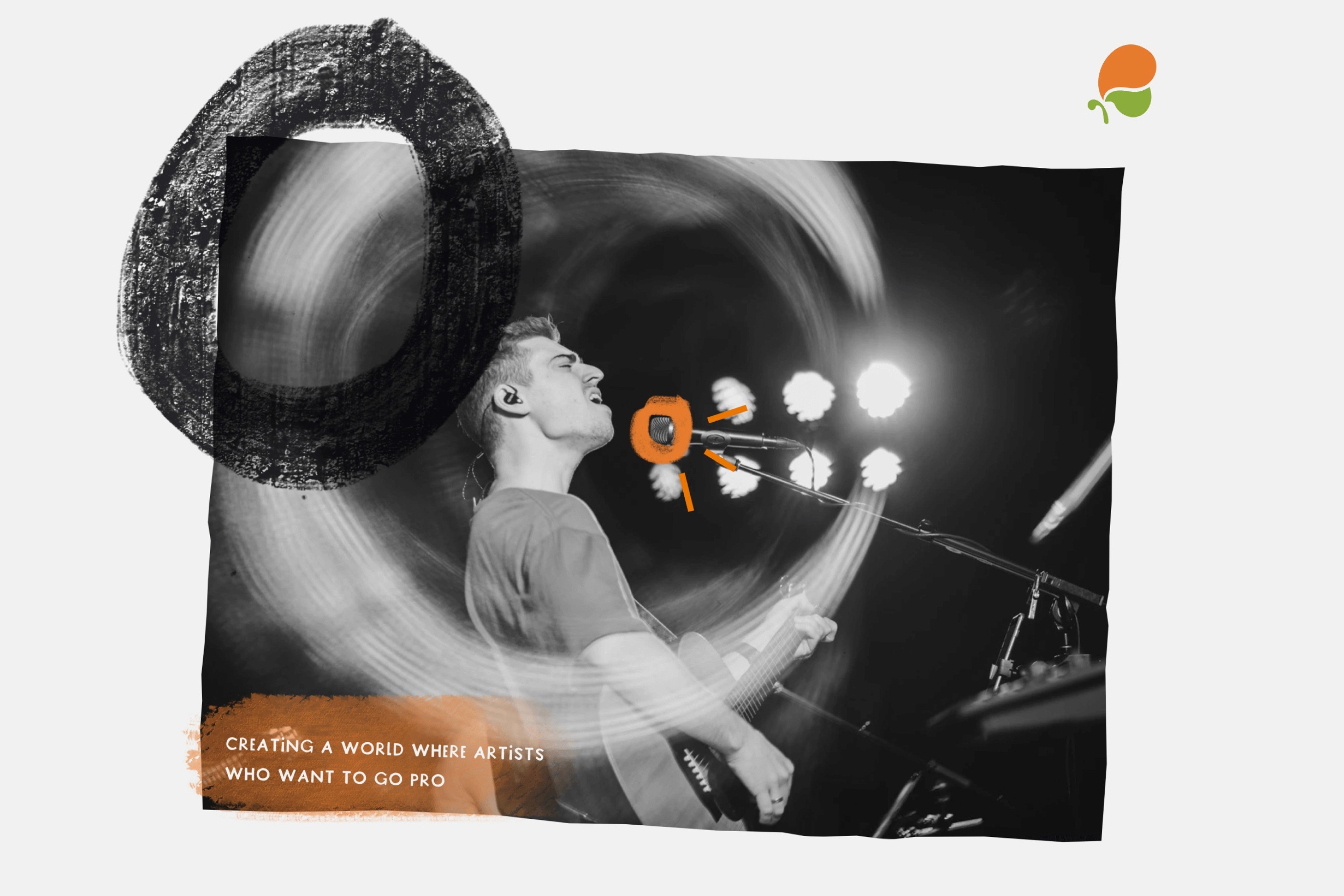
iMusician provides a digital music distribution service. Artists sell their music with iMusician and reach hundreds of international shops including Spotify, Apple Music, and Amazon, to Beatport and Traxsource, as well as hi-res retailers and popular regional shops, get big in Japan, and beyond. — Berlin, 2020
iMusician provides a digital music distribution service. Artists sell their music with iMusician and reach hundreds of international shops including Spotify, Apple Music, and Amazon, to Beatport and Traxsource, as well as hi-res retailers and popular regional shops, get big in Japan, and beyond. — Berlin, 2020
Challange
Challange
In 2020, I met the iMusician team and listened to their needs.
Not having a design system was at the root of their problem.
That issue caused some of the killer issues that affect directly the user experience. After my first quick analysis, I found lots of consistency issues, layout hierarchy issues, and missing UI design fundamentals.
Our main goal was to build a design system and documentation about the design foundation and components that everyone can onboard easily, working on it is fun.
Kickoff
Kickoff
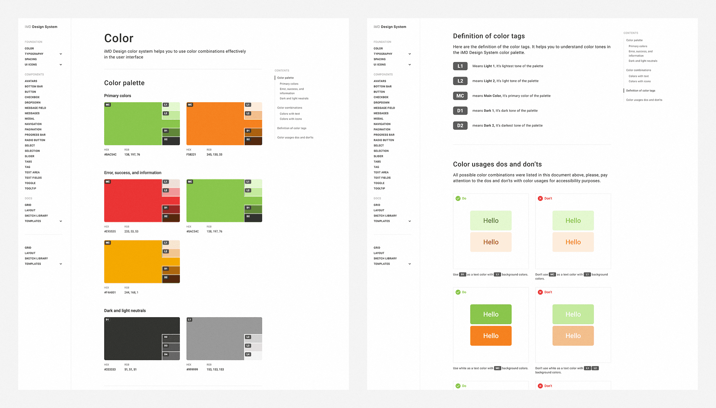
Create a new design system library — I collaborated with the iMusician product, design, and engineering team to make library structure, class naming, new SVG icons, grids, typography, color palette, and decide on new components we need to have.
Build a scalable dashboard — We have built a scalable dashboard structure that can adapt to all content structures on the platform, from campaigns to complex forms, from analytics pages to comprehensive settings page. Resolving layout hierarchy problems of the current interface was one of our critical issues.
Adapting the iMD design system — As a last step of the process, we’d re-build all the screens of iMusician platform from scratch by integrating the Sketch DS Library we created.
1. Create a new design system library
1. Create a new design system library
In this step, we analyzed the platform to complete the inventory work. We listed all the visual assets, components, colors, icons, and typography styles as a result of the inventory work. We extracted the versions that misused variants and unnecessarily duplicated versions.
Some problems we faced were:
Problems and solutions
Problems and solutions
Buttons — There were 2 different button components on the platform. There was no logic or rules about their usage. There were different usages on almost every page in the dashboard. Their colors, text labels, margins, and round corners were inconsistent.
Buttons — There were 2 different button components on the platform. There was no logic or rules about their usage. There were different usages on almost every page in the dashboard. Their colors, text labels, margins, and round corners were inconsistent.

1.Primary

1.Secondary

2.Primary

2.Secondary
Buttons from the platform
We decided that create a button component that has 3 variants which are primary, secondary, and tertiary to use in the whole platform. We also used green color as our primary color. Based on the psychological effects of colors, we know that cool colors like green are typically considered restful, peaceful, and calming. It's also a brand color of the iMusician, besides orange.
We decided that create a button component that has 3 variants which are primary, secondary, and tertiary to use in the whole platform. We also used green color as our primary color. Based on the psychological effects of colors, we know that cool colors like green are typically considered restful, peaceful, and calming. It's also a brand color of the iMusician, besides orange.

Primary

Secondary

Tertiary
New buttons
Form elements — We found 3 different form styles for form element components like text input, message field, select, etc. The logic about the usage was also missing for these components too.
Form elements — We found 3 different form styles for form element components like text input, message field, select, etc. The logic about the usage was also missing for these components too.

Transparent

Solid

Ghost
Form elements from the platform
We designed form components that work on all background colors and keep consistency between each other in the dashboard.
We designed form components that work on all background colors and keep consistency between each other in the dashboard.

New form components
Visual balance — We found an issue with component heights that cause visually unbalanced. We saw this issue, especially, when the components’d be placed in the same row in the UI.
Visual balance — We found an issue with component heights that cause visually unbalanced. We saw this issue, especially, when the components’d be placed in the same row in the UI.

Elements from the platform

New components
Difference between new and old components
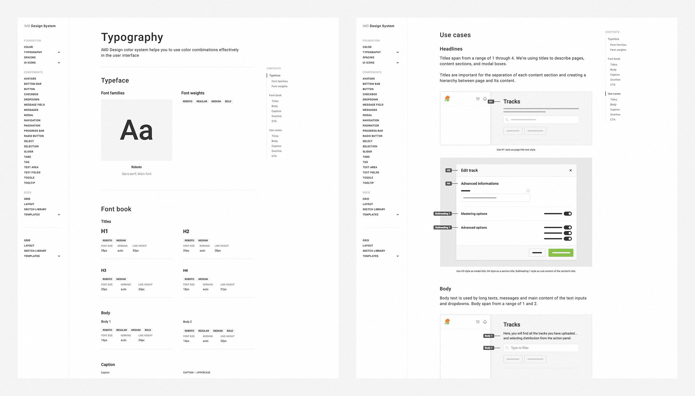
Storybook documentation
Storybook documentation
As I mentioned above, we created a Sketch library by resolving many problems we faced at the UI level. In our next step: we built a storybook that provides tech specs, use cases, and limitations of the all assets and elements we got in the first step.
As I mentioned above, we created a Sketch library by resolving many problems we faced at the UI level. In our next step: we built a storybook that provides tech specs, use cases, and limitations of the all assets and elements we got in the first step.
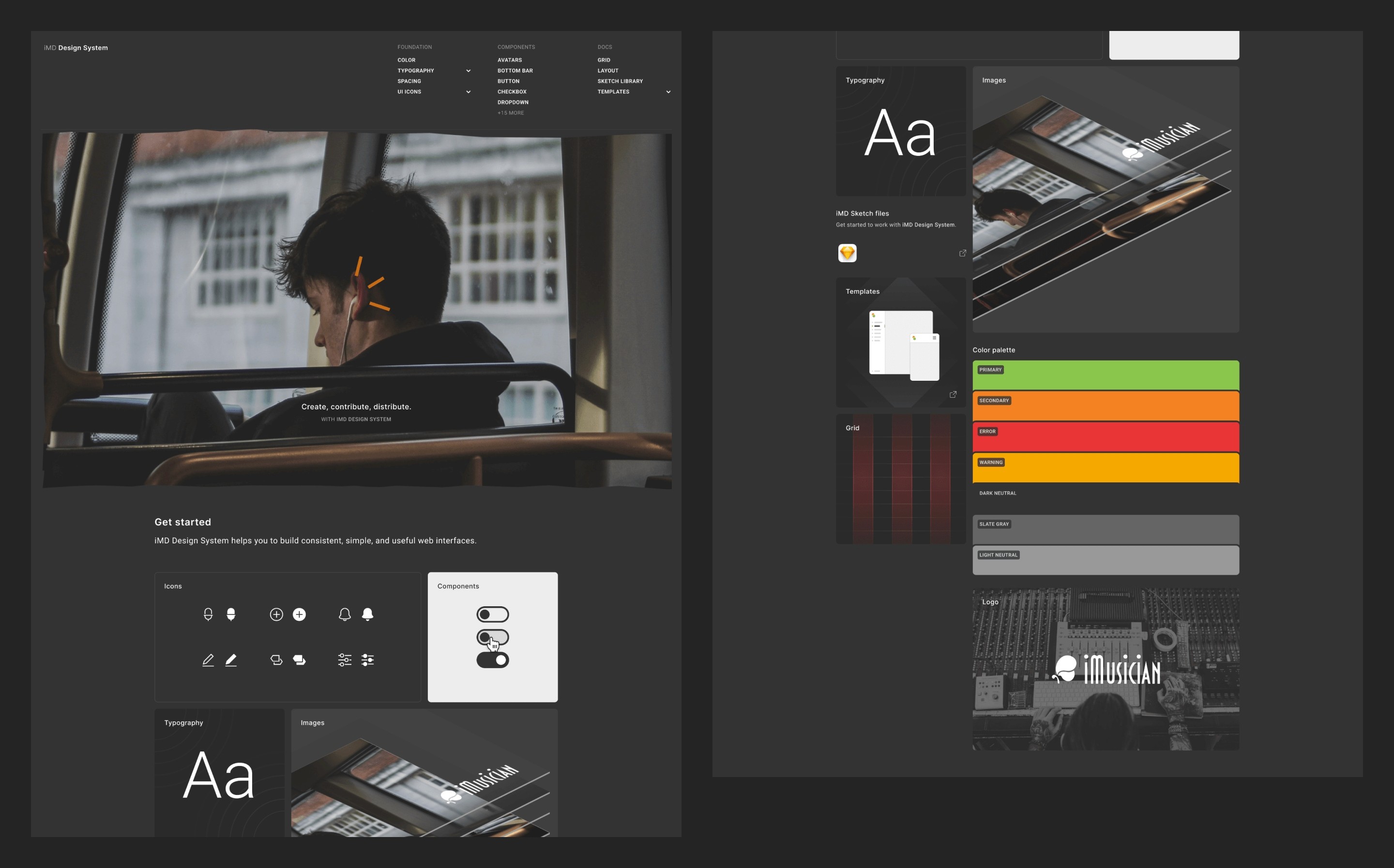
Our main goal in the first phase of the storybook project was, to create an infrastructure for future improvements by keeping the design and engineering efforts at a minimum.
What we had done in this scope was:
Providing a documentation platform that gives the knowledge and the rules for the use cases and colors, font book, icons, and all the design foundation elements.
Listing the components with all states and interactions besides the tech specs and the use cases.
Building the IA of the storybook platform.
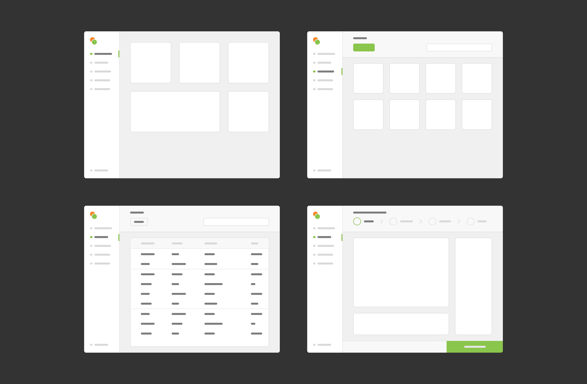
2. Build a scalable dashboard
2. Build a scalable dashboard
We resolved some layout issues the current platform has. We turned the core elements we have in the content structures into reusable components by using the assets we have in the iMD DS library. Furthermore, we finally have building blocks that create an infrastructure of our platform with the work we did in this part.
We resolved some layout issues the current platform has. We turned the core elements we have in the content structures into reusable components by using the assets we have in the iMD DS library. Furthermore, we finally have building blocks that create an infrastructure of our platform with the work we did in this part.
3. Adapting the iMD design system
3. Adapting the iMD design system
We came to the last step with the iMD DS library and the core layout schemes that creates the infrastructure of our platform, so, we started to redesign our platform from top to bottom by considering all states and interactions and using the all sources we had.
Our main goal was, to create a new version of the platform that solved the problems it has by keeping the concept design, general layout, and user experience approaches.
You can see the before/after images to understand the improvements we did.


